Trying to convert inches to pixels can feel like a trick question. There’s no single, fixed answer, and that’s because the whole conversion hinges on one crucial value: Pixels Per Inch (PPI).
Get that right, and the maths is actually dead simple.
The Core Formula to Convert Inch to Pixels
Everything comes down to this one calculation:
Pixels = Inches × PPI
This little formula is the bridge between a physical measurement (an inch on a ruler) and its digital equivalent (a bunch of tiny squares on a screen). An inch is always an inch, but the number of pixels squeezed into that space changes depending on where the image will be seen. This variable is the resolution, measured in PPI.
Think of it this way: a higher PPI packs more pixels into every inch. This creates a sharper, more detailed image that looks crisp and professional. A lower PPI means fewer pixels, which can lead to that dreaded blurry or "pixelated" look if you're not careful.
Why PPI is Everything
The context of your project dictates the PPI you need to use. The two most common scenarios are worlds apart.
- For web and screen use, a standard of 96 PPI has been the go-to for years.
- For high-quality printing, you need a much higher density, with 300 PPI being the industry benchmark.
This infographic breaks it down visually. You can see how a single inch translates into vastly different pixel counts depending on whether it’s destined for a screen or a printer.
As you can see, that one-inch space for a print job requires more than three times the number of pixels as its web counterpart.
Key Takeaway: You can't convert inches to pixels without knowing the PPI for your project. It's the essential piece of information that connects the physical world to the digital one.
To make this even clearer, here’s a quick-glance table showing how a single inch converts at the most common PPI values.
Quick Conversion Chart: 1 Inch at Common PPI Values
This table shows the resulting pixel dimension for a single inch at various standard PPI settings, illustrating the direct relationship between PPI and the final pixel count.
| Physical Size (Inches) | PPI (Pixels Per Inch) | Resulting Digital Size (Pixels) | | :--------------------- | :-------------------- | :------------------------------ | | 1 inch | 72 PPI | 72 pixels | | 1 inch | 96 PPI | 96 pixels | | 1 inch | 150 PPI | 150 pixels | | 1 inch | 300 PPI | 300 pixels |
See the pattern? The pixel count always matches the PPI for a one-inch measurement. For two inches at 300 PPI, you'd just double it to 600 pixels. It's that straightforward once you know the resolution you're aiming for.
Why PPI Is the Key to Accurate Conversions
Ever tried to find a universal chart to convert inches to pixels, only to come up empty-handed? There’s a very good reason for that.
Asking “how many pixels are in an inch?” is a bit like asking “how long is a piece of string?” without a ruler. The answer depends entirely on one crucial variable: Pixels Per Inch (PPI).
This value is the secret ingredient that makes any accurate conversion possible. It defines the density of pixels on a screen or within a digital image. In simple terms, it tells you exactly how many tiny squares of light are packed into a one-inch line.
Without knowing the PPI, an inch has no fixed pixel equivalent. You aren’t just converting units; you’re translating a physical measurement into a digital grid whose density can change dramatically from one device to another.
The Evolution of Screen Density
In the early days of computing, things were much simpler. Most monitors hovered around a standard resolution, making 72 PPI or 96 PPI a reliable assumption for web design. For a long time, these values were the default settings in most design software, and they worked just fine.
But technology never stands still.
The arrival of high-resolution monitors, Apple's "Retina" displays, and 4K screens changed everything. A modern smartphone can pack over 400 pixels into a single inch, while a standard desktop monitor might still be closer to 100 PPI. This huge variation means a one-inch line on your laptop screen could contain a completely different number of pixels than a one-inch line on your phone.
Getting this wrong is the difference between a design that looks sharp and one that’s blurry and unprofessional.
A physical inch is constant, but its digital representation in pixels is not. The PPI value acts as the translator between these two worlds, and choosing the right one is essential for your project's success.
This variability has been a long-standing headache for designers. For instance, in the UK during the 2010s, the rapid adoption of different screen resolutions created huge inconsistencies. As users shifted from old 1024×768 monitors to widescreen formats and eventually Full HD (1920×1080), a one-inch element could appear 10-20% larger or smaller depending on the user's setup. This was a major factor that pushed the UK web industry towards responsive design instead of fixed-size layouts. You can explore more about historical screen resolution trends and their impact.
PPI vs DPI: What’s the Difference?
You'll often hear PPI mentioned alongside another term: DPI (Dots Per Inch). While people often use them interchangeably, they refer to two completely different things.
It’s simple, really.
- PPI (Pixels Per Inch) describes the resolution of a digital screen or image file. It's all about the pixels you see on a display.
- DPI (Dots Per Inch) refers to the resolution of a physical printer. It describes how many dots of ink a printer can place within a one-inch line on paper.
For any screen-based work—websites, apps, digital ads—you will always be working with PPI. For print projects, DPI is the metric that matters. The concepts are similar, as both measure density, but their applications are distinct. Knowing which one to use is the first step to getting your conversion right.
Putting It All to Work on the Web
Let's move from the formula to the real world. How does this inches-to-pixels conversion actually play out when you're designing for screens? This is where the rubber meets the road for anyone creating websites, app UIs, or digital ads, because consistency across devices is everything.
When you design for the web, you're not designing for one screen—you're designing for thousands. You have standard desktop monitors on one end and super-crisp "Retina" displays on the other, each with a wildly different number of pixels crammed into every inch. This is exactly why getting a handle on PPI is such a crucial skill.
The Old Faithful: 96 PPI for Standard Screens
For a long, long time, the industry standard for web graphics was a straightforward 96 PPI. Think of it as a reliable starting point, a common language between your physical idea and the digital screen. It’s perfect for calculating asset sizes meant for a typical desktop monitor.
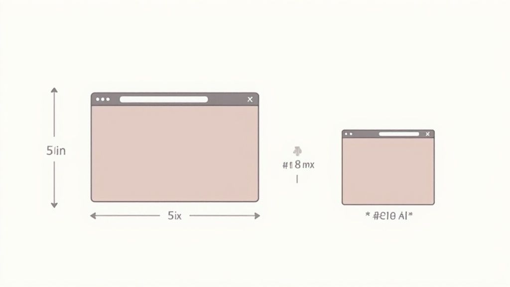
Here’s a practical example. Imagine a client asks for a hero banner on their website that should look about five inches wide on a standard screen.
The maths is simple using our formula:
- 5 inches × 96 PPI = 480 pixels
Boom. You now have a target width of 480 pixels for your image. If you create your banner at this size, it will show up at the intended physical size on any display that happens to have a 96 PPI density. But in today's world, that's just the start.
Planning for High-Density "Retina" Displays
So what happens when that 480-pixel banner gets viewed on a high-resolution screen, like an Apple Retina display or a 4K monitor? These screens pack in at least double the pixel density of their standard counterparts. Your 480-pixel image will suddenly look fuzzy and undersized because it just doesn't have enough data to fill the space sharply.
The solution is a cornerstone of modern design: responsive imaging. You simply create multiple versions of the same asset.
- The @1x Asset: This is your baseline image—in our case, 480 pixels wide. It’s for standard-density screens.
- The @2x Asset: This version is created at double the resolution, or 960 pixels wide (480 × 2). It's specifically for high-density screens.
By providing both, you let the browser do the heavy lifting. It detects the user's screen and serves up the right file, making sure your design looks crisp and professional no matter where it’s viewed.
Pro Tip: When you’re exporting assets from a tool like Figma or Adobe XD, always generate both @1x and @2x versions. Modern design software makes this incredibly easy with built-in export settings, so there’s really no excuse for shipping a blurry logo.
Where CSS Takes Over
While knowing how to convert inches to pixels is essential for creating your image files, it’s also important to know that modern web development has mostly moved away from using fixed pixel values for layouts. Instead, developers rely on relative units.
These are things like:
- Percentages (%): Sizes something based on its parent container.
- Viewport Units (vw, vh): Sizes elements relative to the browser window itself.
- Relative Units (rem, em): Scales elements based on font sizes.
These clever CSS units allow a website’s layout to adapt and reflow beautifully on any screen, from a tiny phone to a huge monitor. It’s the magic behind responsive design.
So, while you’ll almost never see a developer set a website element’s width to 5in in the code, the job of creating that perfectly sized, high-quality graphic still starts with that fundamental inch-to-pixel conversion. Get your assets right from the beginning, and the final product will look a whole lot better for it.
Getting Your Conversions Right for High-Quality Print
When your design jumps from a screen to a piece of paper, the entire game changes. For print projects, a flawless inch-to-pixel conversion isn't just a nice-to-have; it's the bedrock of a professional-looking final product. Forget the forgiving nature of screen resolutions—here, precision is everything.
Unlike web graphics, the print world operates on a gold standard: 300 Dots Per Inch (DPI). This high density of dots ensures that when ink hits paper, the result is crisp, clear, and free of jagged edges or pixelation. For anything people will see up close—photos, brochures, business cards—you absolutely need to aim for 300 DPI.
A Real-World Print Scenario
Let’s walk through a super common task: prepping a standard 6x4 inch photograph for a professional print run. You can't just eyeball the pixel dimensions. You need to calculate them precisely to meet that 300 DPI requirement.
The formula makes it simple:
- Width: 6 inches × 300 DPI = 1800 pixels
- Height: 4 inches × 300 DPI = 1200 pixels
There it is. Your image file must be 1800 x 1200 pixels to print perfectly at 6x4 inches. Thankfully, most image editors like Adobe Photoshop do the heavy lifting for you. When you create a new file, just plug in the physical size (6x4 inches) and set the resolution to 300. The software handles the pixel calculation instantly.
Pro Tip: For print, always work backwards. Start with your physical dimensions and the target DPI. This forces you to create a digital canvas with enough pixel data from the get-go, so you aren't trying to stretch a low-resolution image later, which always ends in a blurry mess.
This idea of matching pixel density to physical size isn't new. In the UK, broadcast standards have long influenced this relationship. When BBC2 launched in 1964 on the 625-line system, a typical 19-inch telly had a vertical resolution of about 50 lines-per-inch. That feels ancient compared to modern displays where even a basic laptop can hit over 110 pixels per inch. It’s a great reminder of why understanding the evolution of broadcast resolution helps when converting old media for new, high-density screens.
When Is It OK to Use a Lower DPI?
While 300 DPI is the benchmark, it's not a universal rule. The deciding factor is almost always viewing distance. An image meant to be seen from across the room doesn't need the same pin-sharp detail as one held in your hand.
Think about these situations:
- Large Banners & Posters: If you’re designing a large banner for an event, something viewed from several feet away, 150 DPI is often more than enough.
- Billboards: For truly massive prints like billboards, the DPI can plummet to as low as 20-50 DPI. Why? Because no one is standing two inches away from it.
Choosing the right DPI for the context is a smart way to keep file sizes manageable without compromising the perceived quality. Just be sure to check with your printing service first—they’ll give you the exact specs needed for their equipment.
Common Conversion Mistakes to Avoid
Getting the hang of inch-to-pixel conversions is pretty simple once you know the ropes, but a few common tripwires can still catch you out. I’ve seen them trip up even seasoned designers.
Knowing what these pitfalls are is the secret to making sure your work looks professional every single time, whether it’s for a screen or a printer. Steering clear of these mistakes will save you a ton of headaches and prevent that sinking feeling of a disappointing result.
One of the most frequent slip-ups happens right inside image editing software like Photoshop. It all comes down to a single, powerful checkbox: Resample Image.
When you change an image's PPI, leaving "Resample" ticked tells the software to actually add or remove pixels. It’s a destructive change. But if you untick it, you’re just changing the metadata—basically, a note for the printer telling it how large to print the existing pixels. Forgetting this can be a disaster, like accidentally shrinking a massive, high-res photo into a tiny, useless thumbnail.
Using the Wrong Resolution for the Job
This is a classic. Applying the wrong resolution standard is probably the most common mistake, especially when a design has to work for both digital and print.
That beautiful logo you designed at 72 PPI might look razor-sharp on a website, but it’s going to look blurry and amateurish on a business card. The pixel density just isn't there for a quality physical print.
Here’s a real-world scenario I see all the time:
- The Problem: A designer creates a brand logo that needs to go on a website and printed letterheads. They export the final file at 96 PPI, which looks great on screen.
- The Outcome: The print shop uses that file, and the logo on the letterhead comes out looking fuzzy. It lacks the raw pixel data needed for a crisp 300 DPI print.
- The Solution: Always, always create your master files at the highest resolution required—in this case, 300 DPI. From that master file, you can easily export a smaller, web-friendly version.
This simple workflow—start with print quality, then scale down for digital—is a non-negotiable best practice. It’s way easier to throw away pixel data than it is to invent it without losing quality.
Ignoring the Final Viewing Context
Finally, a huge mistake is just not thinking about the final viewing environment. You might meticulously convert inches to pixels for a huge trade show banner at 150 PPI, which is perfectly fine since people will see it from a distance.
But if you reuse that same banner file for a small flyer that someone will hold in their hands, that lower resolution becomes painfully obvious. The design will look cheap and poorly executed.
Always ask yourself one simple question: "How will someone actually see this?"
The answer tells you exactly what resolution you need. A billboard and a brochure are seen in completely different ways, and their digital files have to reflect that. Get this right, and your hard work will shine no matter the medium.
Questions That Always Come Up
When you start converting inches to pixels, a few questions pop up almost every time. Let's get them answered so you can get your conversions right without any second-guessing.
Can I Convert Inches to Pixels Without Knowing the PPI?
In a word: no. Trying to convert inches to pixels without a PPI value is like trying to exchange currency without knowing the exchange rate. It’s the missing link.
The formula itself, Pixels = Inches × PPI, tells you everything. The PPI is the bridge connecting the physical world of inches to the digital world of pixels. Without it, the relationship is undefined.
What’s the Real Difference Between PPI and DPI?
This is a big one. People use these terms interchangeably all the time, but they refer to two completely different things. Getting it right is key to getting professional results.
It's actually quite simple:
- PPI (Pixels Per Inch) is for screens. It measures the pixel density of a digital display or an image file. Think monitors, phones, and digital photos.
- DPI (Dots Per Inch) is for print. It measures how many dots of ink a physical printer places on a piece of paper. This is all about photos, business cards, and brochures.
For anything you’re creating for a screen, focus on PPI. If it’s destined for a printer, DPI is what matters. Keeping this straight will save you from common mistakes, like sending a blurry, low-PPI web graphic to be printed.
How Does This Apply to CSS for Web Design?
Fantastic question. This is where things get a bit more modern. While you absolutely need to understand PPI to create your initial image assets, you’ll rarely use physical units like inches directly in your CSS code anymore.
The px unit in CSS isn't a simple hardware pixel. It's a "reference pixel," an angular measurement designed to look roughly the same size no matter the device. This is why one CSS px might be rendered by a single physical pixel on a standard monitor but by a 2x2 grid of four physical pixels on a high-resolution Retina display.
This is exactly why web designers and developers now lean on flexible, relative units like rem, %, and vw for layouts. They let a site adapt gracefully to any screen. But even so, the job of creating sharp, perfectly sized images still starts with knowing how to convert inches to pixels at the right PPI.
Ready to sharpen your logical thinking? Queens Game offers a fresh challenge based on classic chess rules, perfect for puzzle lovers and strategic minds. Test your problem-solving skills with this elegant brain teaser, playable right in your browser. Start your first puzzle today at https://queens.game.