Putting an image in a grid layout is one of those fundamental skills you'll use constantly in modern web design. At its heart, it's simple: you define a container with display: grid and then drop your <img> elements inside. This one CSS property unlocks a powerful way to create organised, responsive, and visually clean galleries and interfaces with surprisingly little code.
Laying the Groundwork for Image Grids

Before you start building complex, beautiful image layouts, you need to get the basics right. It all starts with a clean HTML structure and that single CSS property: display: grid. This declaration instantly turns a plain container into a powerful grid system, ready to organise whatever you put inside it—in our case, images.
You’ll quickly run into a common snag, though. By default, an image will try to keep its original size. If that image is wider or taller than the grid cell it’s supposed to be in, it will just overflow, breaking the clean lines of your layout. This isn't a bug; it's just the starting point from which we build all our control.
Defining Your Grid Structure
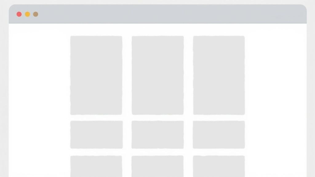
The first step to taming that overflow is defining your grid's structure with grid-template-columns. This property is where you tell the browser how many columns you want and how wide they should be. While you can use fixed units like pixels, flexible units like percentages or the fractional unit (fr) are far more practical for responsive design.
For instance, grid-template-columns: 1fr 1fr 1fr; creates a simple, three-column layout where each column takes up an equal slice of the available space. This is where the magic really begins, as you establish the core logic of your layout.
Before we go further, here's a quick reference for the essential properties you'll be working with.
Essential CSS Grid Properties for Image Layouts
| Property | What It Does | Common Usage |
| :--- | :--- | :--- |
| display: grid | Activates the grid layout on a container. | The very first step. Apply it to the parent element holding the images. |
| grid-template-columns | Defines the number and size of columns. | repeat(3, 1fr) or 1fr 1fr 1fr for equal columns. |
| grid-template-rows | Defines the number and size of rows. | auto or a fixed height like 200px. Often left to auto-size. |
| gap | Sets the spacing between grid cells. | gap: 1rem; for consistent spacing between all images. |
These properties are the bread and butter of grid layouts. Mastering them will get you 90% of the way there for most common image grid tasks.
Key Takeaway: The
frunit is your best friend for fluid grids. It automatically calculates column sizes based on the available space, making it an indispensable tool for building layouts that adapt to different screen sizes without complex calculations.
This structured approach isn't just for photo galleries. The logic behind creating a grid is similar to organising elements in complex visual puzzles. For those interested in logical challenges, you can explore some of the hardest Sudoku puzzles, which also rely on placing items within a rigid grid structure. By mastering these fundamental properties, you set the stage for solving much more advanced layout challenges.
Getting Your Images to Fit Perfectly in Grid Cells
One of the first puzzles you'll solve with any image in grid layout is simply getting the pictures to fit. If they're too big, they'll spill out and wreck your design. Too small, and you're left with awkward gaps.
The modern fix for this is surprisingly simple and powerful: the CSS object-fit property.
In the old days, we had to resort to hacks like using background-image on a <div>. But that approach is terrible for accessibility and SEO — search engines and screen readers can't "see" background images. Using a real <img> tag with object-fit gives you clean, semantic HTML and total visual control. It’s the best of both worlds.
Mastering Cover vs. Contain
You'll use two object-fit values 99% of the time: cover and contain. Understanding the difference is what separates a decent layout from a great one.
-
object-fit: cover;This tells the image to fill its container completely, even if that means cropping a bit off the sides. The aspect ratio is always preserved. Think of it as a "zoom and crop" effect. It's perfect for photo galleries where you want a uniform, gap-free look. -
object-fit: contain;This scales the image down until it fits entirely inside the cell, again without distorting it. If the image's proportions don't match the grid cell's, you'll see some empty space (often called "letterboxing"). This is the go-to choice when you absolutely must show the entire image, like with logos or detailed product shots.
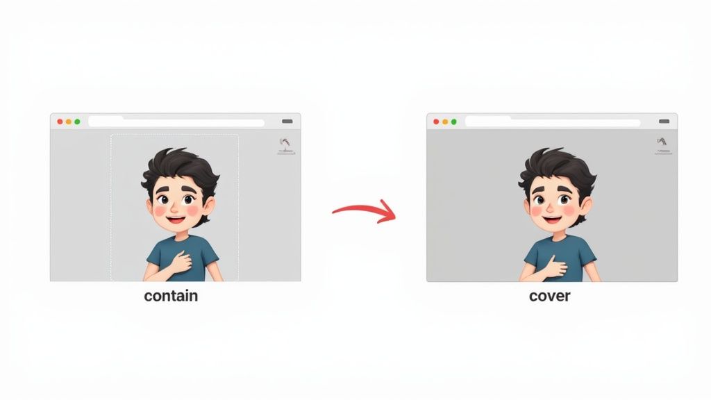
This screenshot from MDN Web Docs nails the difference.

As you can see, cover fills the space by cropping, while contain keeps the whole image visible by adding gaps.
The magic combination is setting the image's
widthandheightto 100%, then adding yourobject-fitproperty. This tells the image to first try to fill the cell, and thenobject-fithandles the scaling logic. Simple, clean, and incredibly effective.
Building Responsive and Accessible Image Grids
Just dropping an image in a grid is easy. The real test is making that layout look perfect on any device, from a tiny phone to a huge desktop monitor. This is where CSS Grid really shows its magic, often letting you build a completely responsive design without writing a single media query.
The trick is to combine a few powerful CSS functions. Instead of locking yourself into rigid columns like 1fr 1fr 1fr, you can build a dynamic system that just adapts. It’s a lot like how a country’s infrastructure is designed for resilience.
Think about the UK's National Grid, built between 1926 and 1933. It spanned 4,000 miles to connect 122 different power stations, making energy reliable and cheaper for everyone. A well-built CSS grid does the same for a website's layout: it makes it robust and efficient. You can read more about this massive engineering project and its impact on Great Britain's electricity infrastructure. We can apply that same mindset directly to our CSS.
Crafting a Fluid Grid Layout
To create this kind of self-adjusting grid, we can use a brilliant one-liner for grid-template-columns:
repeat(auto-fit, minmax(250px, 1fr));
Let's quickly break down what this is doing:
repeat(): A handy function that stops you from typing out column definitions over and over.auto-fit: This keyword tells the grid to squeeze in as many columns as it can. As the screen gets wider, it expands the existing items to fill the space instead of leaving empty tracks.minmax(250px, 1fr): This is where the logic happens. Each column must be at least 250px wide, but it can stretch to fill any extra space by taking up an equal fraction (1fr) of it.
That single line of code creates a grid that automatically wraps columns onto new lines when the screen shrinks. It's an elegant solution that takes care of most responsive scenarios for you.
Making Your Grid Accessible to Everyone
A beautiful grid is useless if some people can't use it. Accessibility should never be an afterthought. For images, the most important thing you can do is get the alt attribute right.
Crucial Tip: Every single
<img>tag needs analtattribute. If an image is just for decoration, use an empty one (alt="") so screen readers know to skip it. For any image that conveys information, write a short, clear description.
This ensures that anyone using a screen reader can understand the purpose of each image in your layout. Finally, always test that your grid can be navigated using only the keyboard—users should be able to Tab through the images in a logical order.
Advanced Techniques for Creative Layouts
Once you've got the hang of responsive grids, you can start bending the rules to create some truly memorable designs. A standard, symmetrical layout is fine, but sometimes you need an image in grid to really grab attention and serve as a focal point. This is where we move beyond simple column setups and start telling individual items exactly where to go.
By using grid-column and grid-row, you can make a single image break free from its cell and stretch across multiple tracks. For instance, grid-column: 1 / 3; tells an image to start on the first grid line and span all the way to the third, neatly covering two columns. It's a fantastic technique for creating a strong visual anchor in a portfolio or product gallery.
Defining Layouts with Grid Template Areas
For even more intuitive control over complex layouts, grid-template-areas is an absolute game-changer. This property lets you name your grid cells and then literally draw your layout right there in the CSS. It reads almost like an ASCII art diagram of your page, which makes the structure incredibly easy to grasp and tweak later on.
You can define areas like "header", "sidebar", "main-image", and "footer", then simply assign each element to its named area. This is by far one of the most readable ways to build complex, asymmetrical designs.
When I'm designing a tricky layout, I almost always sketch it on paper first. Naming the areas in your CSS based on that sketch makes translating your vision into code so much more straightforward.
Layering Content within a Grid Cell
Don't forget that a grid cell isn't just a box for one thing; it's a space where you can layer multiple elements. By placing both an <img> tag and, say, an <h3> inside the same grid cell, you can create really compelling overlays.
To control which element appears on top, you just need the z-index property. Giving your text a higher z-index than your image ensures it always appears in front. It's a simple but powerful way to add depth and context directly onto your visuals.
This whole approach of placing items strategically on a grid is fundamental to countless logic puzzles. For a deeper look at grid-based problem-solving, our article exploring the classic N-Queens problem shows how these same principles apply to much more complex challenges. Mastering these advanced methods is what transforms a basic gallery into a sophisticated, engaging user experience.
A Hands-On Guide to Building a Chessboard
Okay, theory is great, but let's get our hands dirty. It’s time to build a complete chessboard using CSS Grid, pulling together everything we've covered about placing an image in grid layouts. This is the perfect real-world project to see how all the pieces snap into place.
Our goal is simple: create a standard 8x8 grid. We’ll start by setting up the board itself, defining the alternating black and white squares. After that, we’ll place queen images onto specific cells to show just how much control you have over each item.
Setting Up the Board and Squares
The HTML for this is refreshingly simple. All you need is a parent <div> for the board and 64 child <div> elements for the squares. The CSS is where the magic happens. We’ll apply display: grid to our board and use grid-template-columns: repeat(8, 1fr); to instantly create our eight perfectly equal columns.
What about the alternating colours? We can handle that with a slick CSS selector. By targeting odd and even-numbered children within each row, we can apply different background colours without cluttering our HTML with extra classes. It's a clean, efficient way to create that classic checkerboard pattern.
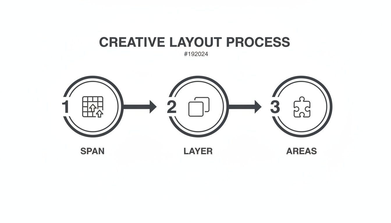
This little diagram shows how you can take basic grid properties and really run with them to create some impressive layouts.

As you can see, things like spanning, layering, and named areas are the tools that let you move from a simple grid to a complex, deliberate design like our chessboard.
Placing the Pieces
Once the board is built, adding the pieces is a piece of cake. Each square is already a grid cell. We can just drop a queen <img> inside any square, and it will be contained perfectly.
For more complex setups, like solving a puzzle, you’d use grid-column and grid-row to position each piece exactly where the challenge requires. This kind of hands-on problem-solving is a fantastic mental workout. If you enjoy this type of challenge, you might like our collection of chess puzzles for beginners as a fun next step.
By the time you're done with this project, you'll have a tangible example of how to manage a complex
image in gridsystem with total confidence—from the initial HTML markup right down to the final CSS positioning. It's a powerful demonstration of what CSS Grid can really do.
Got Questions About Placing Images in Grids?
As you get deeper into CSS Grid, a few common questions always seem to surface. You start wondering about the finer points of alignment, responsive behaviour, and even animations. Let's tackle some of the ones I hear most often.
How Do I Perfectly Centre an Image in a Grid Cell?
This is probably the most frequent challenge people run into. You've placed an image, but it's stuck in the corner. While you could wrestle with old-school margins, there’s a much simpler, modern way.
Treat the grid cell itself as a layout container. Just add display: grid; and place-items: center; to the cell's CSS, and voilà—the image inside will be perfectly centred, both horizontally and vertically. It’s a beautifully concise trick that works every time without extra markup or fussy positioning. Honestly, it's my go-to for any centring job.
Auto-Fit vs Auto-Fill: What’s the Real Difference?
When you’re building responsive galleries, auto-fit and auto-fill are your best friends. They look similar and behave almost identically, but one key difference can make or break your layout.
Both auto-fit and auto-fill will create as many grid columns as can squeeze into the container. The split happens when there's leftover space. auto-fill will stubbornly keep empty tracks around, which can leave you with ugly whitespace at the end of a row.
On the other hand, auto-fit is smarter about it. It collapses those empty tracks and lets the existing items grow to fill the available space. For a typical image gallery where you want a clean, edge-to-edge feel, auto-fit is almost always what you want.
Pro Tip: Use
auto-fillwhen you need a fixed number of tracks, even if some are empty. Useauto-fitwhen you want a fluid layout where items stretch to fill the void.
Can You Animate an Image Moving Between Grid Cells?
I get this one a lot from developers looking to add a little flair. Can you make an image glide from one cell to another? The answer is a big yes, and it can add a fantastic, dynamic feel to your UI.
The secret is that you don't animate the grid itself—you animate the image within it. Properties like grid-column and grid-row are animatable. All you need to do is apply a CSS transition to the image element. Then, use JavaScript to trigger a class change that moves the image to a new row or column. The browser handles the rest, creating a smooth animation from its old spot to the new one.
Ready to put your grid-based logic to the test? Queens Game offers a fresh take on classic chess puzzles, challenging your strategic thinking on a grid. Sharpen your problem-solving skills and play for free.