Interpolation is just a fancy word for estimating unknown values that fall between your known data points. Think of it as a smart way to fill in the gaps in a dataset, assuming there’s a consistent trend connecting your figures.
What Is Interpolation and Why Does It Matter for Your Data?
Ever found yourself staring at a spreadsheet with frustratingly empty cells? Maybe you have monthly sales figures but need to estimate the number for a specific week. Or you have scientific readings taken every 10 minutes but need a value for the third minute. This is exactly where interpolation becomes one of the most useful tools in your Excel toolkit.
Instead of leaving a blank or making a wild guess, interpolation uses the surrounding data to make an educated estimate. It works on the assumption that a relationship exists between your data points—often a simple straight line. By calculating where your missing point would logically fall on that line, you can generate a reasonable, defensible value.
When Is Interpolation Most Useful?
This technique is incredibly valuable across loads of fields. An engineer might interpolate a material’s strength at a temperature not listed in their manual. A financial analyst could estimate a stock price at a specific time between market open and close. It turns an incomplete dataset into something more continuous and functional.
It’s so reliable, in fact, that it’s routinely used in official statistics. The UK's Office for National Statistics (ONS), for instance, uses modelling and interpolation to produce consistent business population estimates when gaps exist. This approach ensures their data is comparable over time, a practice detailed in their 2023 business data releases. You can read the full ONS report to see these methods applied in the real world.
Key Takeaway: Interpolation isn't just a mathematical trick; it's a practical method for making informed decisions when you have incomplete information. Learning different interpolation in excel techniques adds a powerful layer of analysis to your work.
Mastering this skill is fundamental to good analysis and is a key part of our guide on effective decision-making techniques.
Before we dive into the step-by-step methods, it helps to get a high-level view of the tools available within Excel. Each has its own strengths, depending on what you’re trying to achieve.
Choosing Your Excel Interpolation Method
To help you decide which approach is right for your situation, here's a quick rundown of the most common methods, their best use cases, and how complex they are to implement.
| Method | Best For | Excel Functions/Tools | Complexity |
| :--- | :--- | :--- | :--- |
| Linear Formula | Quick, one-off estimates with two known points. | Basic arithmetic operators (+, -, *, /) | Low |
| FORECAST.LINEAR | Simple linear interpolation for a single point. | FORECAST.LINEAR, FORECAST | Low |
| TREND Function | Estimating multiple missing values in a linear series. | TREND | Medium |
| INDEX & MATCH | Interpolating from a lookup table with non-linear gaps. | INDEX, MATCH, XLOOKUP | Medium |
| Chart Trendline | Visualising and estimating from a graph. | Chart Tools, Trendline Equation | Medium |
| Spline Interpolation | Smooth, curved estimates for non-linear, precise data. | VBA, Add-ins (e.g., XonGrid) | High |
This table should give you a solid starting point. Now, let’s get into the specifics of how to apply each of these methods in your own spreadsheets.
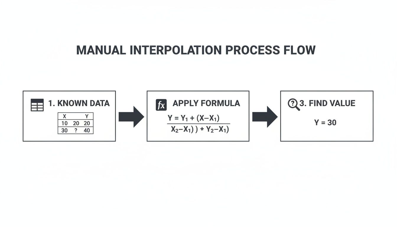
Doing It by Hand: Linear Interpolation with a Manual Formula
Before we even touch Excel’s built-in functions, it’s worth getting your hands dirty with the manual formula. Honestly, building it yourself is the best way to really get what’s happening under the hood. It gives you total control and demystifies how the fancier tools work.
The idea is surprisingly simple. Linear interpolation just assumes there's a straight line between two data points you already know. To find a value that sits somewhere in the middle, you're just finding its exact spot on that line.
How the Formula Actually Thinks
Let’s use a real-world example. Imagine you’re tracking a project budget. After day 10, you’ve spent £2,000. By day 30, that number is up to £7,000. But what about day 15? That’s where this formula comes in.
It works in two steps: first, it figures out the rate of change between your known points (that’s the slope of the line). Then, it applies that rate to the gap between your starting point and the new point you’re trying to find.
Here's the classic formula structure:
y = y1 + (x - x1) * (y2 - y1) / (x2 - x1)
Don’t let the algebra scare you. Here’s what it all means:
- (x, y) is the unknown point you want to find.
- (x1, y1) is your first known data point (e.g., day 10, £2,000).
- (x2, y2) is your second known data point (e.g., day 30, £7,000).
It looks a bit academic, but it’s just a sequence of basic sums that Excel can handle in a heartbeat.
Building a Dynamic Interpolation Tool in Excel
Alright, let's turn that theory into a practical, copy-paste-ready Excel formula using our budget scenario. First, lay out your data so it’s easy to read.
| Day (X-values) | Spent (£) (Y-values) | | :------------- | :------------------- | | 10 | 2000 | | 30 | 7000 |
Next, set up a specific cell where you can type in the day you want to estimate. For this example, we’ll use cell E2 for our target day, which is 15.
Assuming your data lives in A2:B3 (with Day 10 in A2 and Day 30 in A3), pop this formula into any empty cell:
=B2+(E2-A2)*(B3-B2)/(A3-A2)
The moment you type 15 into E2, the formula will spit out the answer: £3,250.
Pro Tip: See how we used cell references (
A2,E2, etc.) instead of typing the numbers directly into the formula? This makes your tool dynamic. You can now change the day inE2to anything between 10 and 30, and the spend estimate will update instantly. No re-writing needed.
This manual method is perfect for quick, one-off calculations or for building simple estimation models right on your sheet. Once you’ve mastered this, you'll find it so much easier to understand—and troubleshoot—the results from Excel’s automated functions. Let's look at those next.
Using FORECAST.LINEAR and TREND for Faster Interpolation
While building the formula yourself gives you a great feel for the mechanics, Excel has built-in functions that do the heavy lifting for you. They’re faster, less prone to typos, and purpose-built for this kind of linear estimation.
The most direct replacement for our manual formula is FORECAST.LINEAR. Think of it as the exact same logic, just neatly packaged into a single command. It needs the same three pieces of information: the new x-value you're solving for, plus the ranges for your known x and y-values.
The process is always the same, whether you do it by hand or with a function. You identify the data you know, apply the logic, and get your estimated value.
The functions just automate the calculation part, which is a huge time-saver.
Single-Point Estimates with FORECAST.LINEAR
Let's go back to our project budget example. We know the spend on day 10 (£2,000) and day 30 (£7,000). Our goal is to estimate the spend on day 15.
The syntax for the function is dead simple:
=FORECAST.LINEAR(x, known_y's, known_x's)
- x: The point you want to estimate (day 15).
- known_y's: The range with your known dependent values (the spend).
- known_x's: The range with your known independent values (the days).
Using the same data layout as before, the formula is just:
=FORECAST.LINEAR(E2, B2:B3, A2:A3)
This one function spits out the exact same result—£3,250—but the formula is cleaner and much easier to read. For any quick, single-value linear interpolation, this is the function to use.
This kind of automation is a lifesaver. In the UK, analysts in finance and engineering rely on Excel’s built-in tools to ensure precision and cut down on manual errors. It's not just about complex functions either; even simple features like Excel's Fill Series command perform a similar kind of interpolation to create evenly spaced data, a trick you see in a lot of UK-based training materials. You can discover more insights about this and other time-saving methods for business analysis.
Multi-Point Interpolation with the TREND Function
But what if you need to fill in a bunch of gaps at once? Maybe you want to estimate the budget for every single day from 11 to 29. Chaining FORECAST.LINEAR formulas together would be a nightmare.
This is where the TREND function comes in.
The TREND function is designed to return a whole array of values, making it perfect for filling an entire series of missing data points in one shot. Its syntax is slightly different but incredibly powerful.
=TREND(known_y's, known_x's, new_x's)
The key difference is the last argument:
- new_x's: This is a range containing all the new x-values you want estimates for.
Let's say you've listed the days from 11 to 29 in cells F2:F20. You can select the corresponding cells for your results (e.g., G2:G20), type the formula below, and just press Enter (in Microsoft 365) or Ctrl+Shift+Enter in older Excel versions.
=TREND(B2:B3, A2:A3, F2:F20)
Instantly, Excel populates the entire range with the interpolated budget for each one of those days. No copying, no dragging, just one formula.
When to Choose Which: Use FORECAST.LINEAR for its simplicity when you need a single estimated value. Switch to TREND when you need to efficiently calculate an entire series of interpolated points along a straight line.
Tackling Non-Linear Data with INDEX and MATCH
So far, we’ve assumed our data follows a neat, straight line. But what happens when it doesn't? Real-world data is often messy and non-linear, with values changing at different rates.

Using FORECAST.LINEAR or TREND on this kind of data can produce seriously misleading results because they force a single straight line over a curve. This is a common headache when working with lookup tables—like trying to find a material’s viscosity at a temperature that isn't listed in your chart. The link between temperature and viscosity is almost never a straight line.
To handle this, we need a smarter, more flexible approach. By combining the INDEX and MATCH functions, we can create a powerful formula that performs a localised linear interpolation. Instead of looking at the whole dataset, it isolates just the two closest points around our target value and runs the calculation only between them. This trick approximates the curve by treating each small segment as its own straight line.
Pinpointing Your Data with INDEX and MATCH
Before we build the full formula, let’s quickly break down how this dynamic duo works. This combination is a classic Excel technique for advanced lookups, and getting your head around it is key.
MATCH(lookup_value, lookup_array, 1): This function finds the position of a value within a range. For interpolation, we use amatch_typeof 1, which finds the largest value that’s less than or equal to our target. It’s perfect for finding the "lower bound" data point.INDEX(array, row_num): This function grabs a value from a range based on its row number. We feed it the position number fromMATCHto tellINDEXwhich data point to pull.
By using MATCH to find the position of the point just before our target, we can then use INDEX to retrieve both that point and the one immediately after it.
Building the Full Interpolation Formula
Let’s apply this to a real-world example. Imagine you have a table of fluid viscosity at different temperatures. Your known data is in A2:B7, and you want to find the viscosity at 45°C, which isn't in the table. Your target temperature (45) is in cell E2.
The full, nested formula looks intimidating at first, but it’s just the standard linear interpolation formula powered up by INDEX and MATCH to find the right x and y values dynamically.
Here’s the complete formula you can adapt:
=FORECAST(E2, INDEX(B2:B7, MATCH(E2, A2:A7, 1)):INDEX(B2:B7, MATCH(E2, A2:A7, 1) + 1), INDEX(A2:A7, MATCH(E2, A2:A7, 1)):INDEX(A2:A7, MATCH(E2, A2:A7, 1) + 1))
Let’s break that monster down:
MATCH(E2, A2:A7, 1): This finds the row number of the temperature just below 45°C.INDEX(A2:A7, ...)andINDEX(B2:B7, ...): These expressions retrieve the actual temperature and viscosity values for the lower and upper bounds.- The Colon (
:): This operator is the clever part. It creates a small, two-cell range on the fly, containing only the two data points needed for the calculation. FORECAST(...): Finally, the standardFORECASTfunction does its thing, but it's only looking at the tiny, two-point ranges we just created.
This technique is essentially a logic puzzle within Excel, forcing us to think about how to isolate and handle data. Building this kind of complex formula is a great way to improve your problem-solving skills, a mindset that pays off well beyond spreadsheets.
Visualising Interpolation with Excel Charts and Trendlines

Formulas and functions are fantastic, but let's be honest—sometimes you just need to see the data. For a quick estimate or a compelling presentation, a visual approach using charts is often the fastest and most intuitive way to perform an interpolation in excel.
This method is all about plotting your known data points on a scatter chart and letting Excel draw the line of best fit. It's a brilliant way to quickly eyeball a trend and pluck out an estimate without getting bogged down in complex formulas.
Creating Your Scatter Plot
First things first, you need to get your data onto a chart. Just highlight your two columns of data—your independent (x-axis) and dependent (y-axis) values. Head over to the Insert tab on the ribbon and choose a Scatter chart. Instantly, Excel plots your known points, giving you a clear visual starting point.
With your chart up, right-click on any of the data points and select Add Trendline. This pops open a formatting pane on the side, packed with options to help you fine-tune your analysis.
Displaying the Equation on the Chart
Here’s where the real magic happens. In the "Format Trendline" pane, find and tick the box for Display Equation on chart. Excel will immediately place the mathematical formula for that line right onto your graph, usually in the classic y = mx + c format.
This equation is now your personal interpolation tool. You can just plug your desired x-value into the formula to calculate the corresponding y-value. It's a quick, visual way to find any point along the line. This approach neatly combines data visualisation with hands-on calculation, a technique that mirrors the skills needed for creative problem-solving in any field.
Key Insight: This method is a winner for presentations. It shows both your data and the model you used for estimation in one simple, compelling visual. Your audience can see exactly how you arrived at your interpolated value.
Choosing the Right Trendline Type
While Linear is the default and often what you need, Excel offers other trendline types for data that doesn't follow a perfect straight line.
- Polynomial: This is your go-to for data with noticeable peaks and troughs. You can even adjust the "Order" to make the curve fit your points more snugly.
- Logarithmic: Use this when your data's rate of change seems to be slowing down as the values get bigger.
- Exponential: The opposite of logarithmic, this is ideal for data that rises or falls at an increasingly rapid pace.
It's worth experimenting with the different types to see which line best "hugs" your data points. Picking the right trendline is crucial for making sure your visual interpolation in excel is as accurate as it can be.
Gotchas and Common Questions
Even with the best formulas, things can get messy when you're working with real-world data. Let's tackle some of the common sticking points that pop up, so you can move from just knowing the formulas to actually using them with confidence.
What Happens If I Estimate Outside My Data Range?
This is probably the most frequent question I get. What if you try to extrapolate—that is, guess a value that's outside the range of your known data points?
Excel's FORECAST.LINEAR and TREND functions will happily give you an answer, but you need to be extremely careful here. These tools just assume the straight line continues forever, which is almost never true in the real world. A little bit of extrapolation can be okay, but go too far and your estimate will be pure fiction.
Why Am I Getting an #N/A Error?
Another classic problem, especially with the INDEX and MATCH method. This error usually pops up if your lookup value is smaller than the first value in your dataset. The fix is simple: make sure your target value is always between the smallest and largest of your known x-values.
Linear vs. Non-Linear: Which One Do I Use?
This is a critical decision. If you plot your data on a chart and it looks like a reasonably straight line, linear methods like FORECAST.LINEAR are your best bet. They’re simple, fast, and easy for anyone to understand.
But what if your data curves? A linear model will give you garbage estimates. For anything with a bend, you need a non-linear approach. The INDEX and MATCH technique is a great starting point, as it essentially "fakes" a curve by connecting your dots with tiny straight lines. For more complex curves, using a polynomial trendline on a chart is often the most accurate way to go.
My #1 Tip: Always, always plot your data on a scatter chart first. A quick glance is usually all you need to decide if a straight-line assumption makes sense or if you need to dig deeper.
Is Interpolation Just a Fancy Guess?
It's an estimate, yes, but it's far from a random guess. Interpolation is a mathematically sound way of making a reasoned calculation based on an existing trend. The accuracy all comes down to how well your data actually fits the model you've chosen.
This skill is incredibly valuable. In the UK, for instance, about two-thirds of office workers use Excel regularly. Public bodies and private-sector consultants are constantly using interpolation on UK datasets to fill in gaps and make informed decisions. If you want to dive deeper, you can learn more about the wide use of statistical functions in Excel and see just how critical these skills have become. Understanding the limits is what separates a novice from an expert.
At Queens Game, we believe mastering logical processes—whether in a spreadsheet or a puzzle—is the key to sharper thinking. Our chess-based logic puzzles are built to train the same systematic reasoning you use in data analysis. Challenge your mind and enhance your strategic thinking today at https://queens.game.